Cell Component
Cell Component or Custom Cell Renderer is the way through which a user can pass custom HTML/DOM to be display within a cell. Create Custom Cell Components to have any HTML markup in a cell.
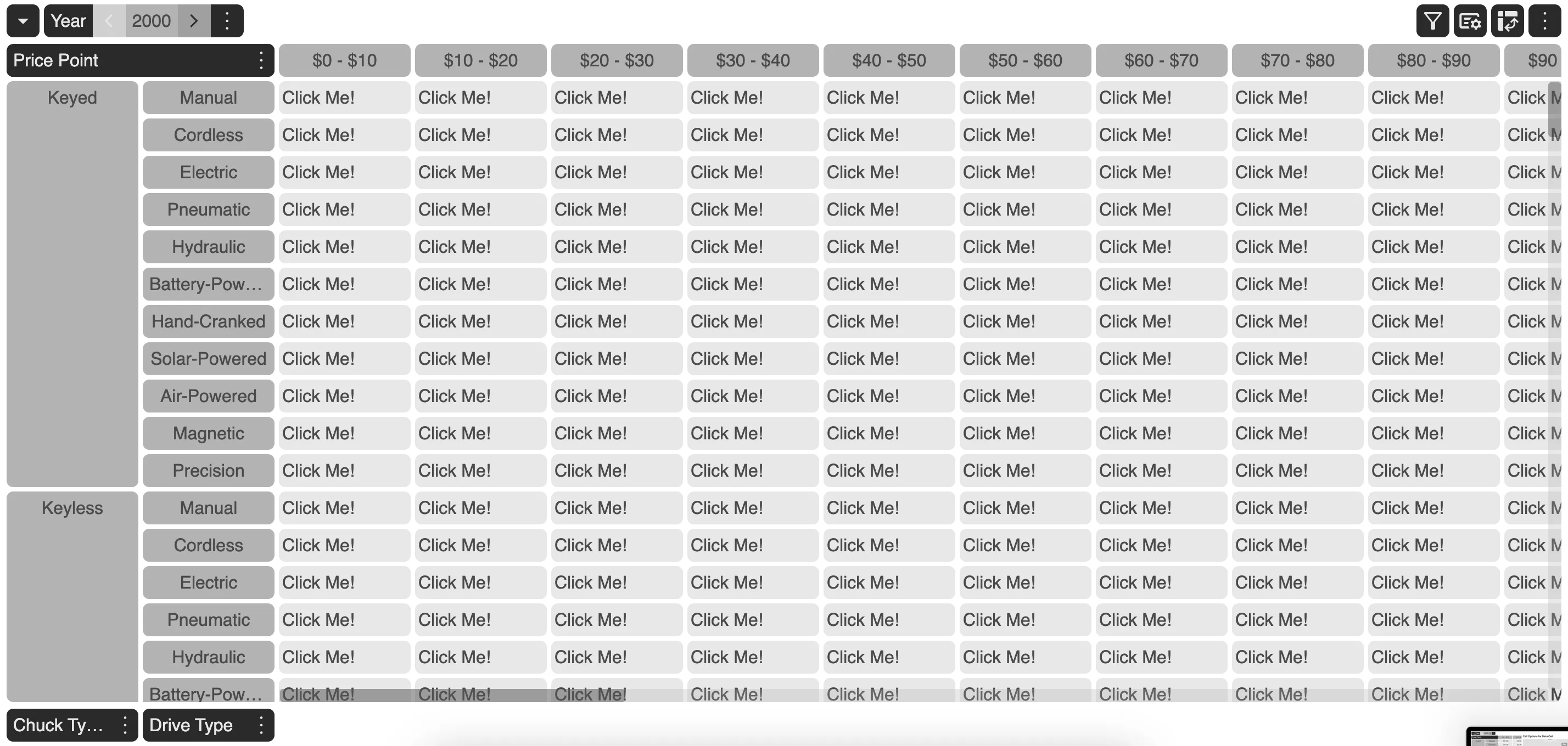
Add buttons, checkboxes or images to cells with a Cell Component.
const customCellRenderer = ( args: ICustomCellRendererCallbackProps): React.JSX.Element => { return ( <div> <button>{"Click Me!"}</button> </div> );};Example
This example demonstrates custom cell components when applied on data grid cells.
The user may choose to switch between Cell Component and Cell Options anytime by going to the Cell Option Modal.
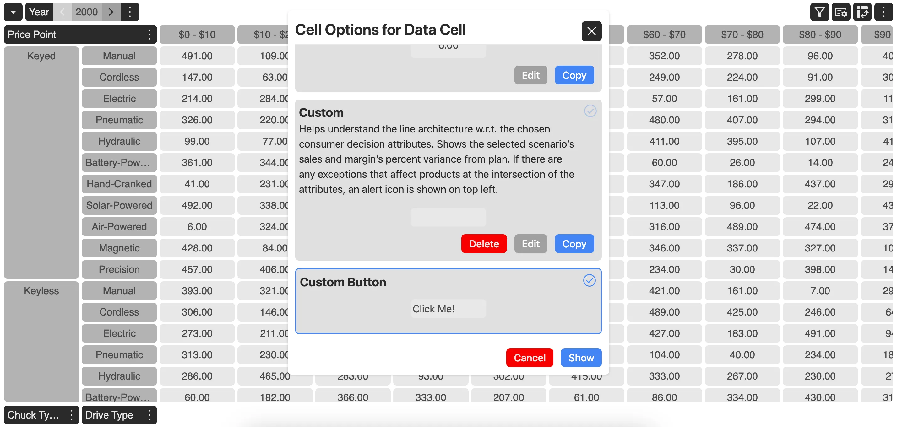
Thus, MDC Grid gives the ability to quickly switch cell appearances as and when needed.
How to set a Cell Component?
Cell Component could either be set on the data grid or on each of the dimension present in the grid.
To set a cell component on the data grid, use setDataCellCustomRenderer on the grid instance.
myGrid.setDataCellCustomRenderer(title, description, function_name);Here, title and description would appear on the Cell Option Modal from where user can switch between cell components or custom cell renderers and cell options.
To set a cell component on any of the dimension present in the grid, use setDimensionCellCustomRenderer on the grid instance.
myGrid.setDataCellCustomRenderer(dimension_id, title, description, function_name);dimension_id refers to the id of the dimension to which the cell component needs to be attached to.