Getting Started
Once we have the code of the grid and the API key for it, we could start initializing the MDC Grid and work through it.
Your First React MDC Grid
Add MDC Grid to your application through the following steps:
-
Placing the code in the root
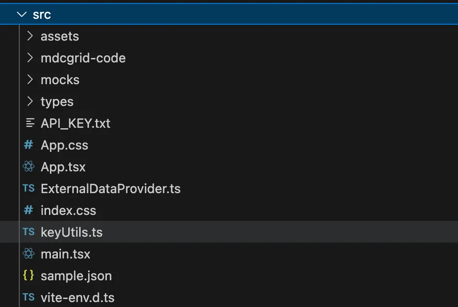
Place the code for the MDC Grid, present in the folder
mdcgrid-code, in the root of thesrcdirectory of your react project.
-
Provide a Container
Create a blank container div in the
App.tsxfile of your project:
const App = () => { .... return () { .... <div id="mdc-grid"></div> } }-
Instantiating the MDC Grid
Instantiate the grid by calling the constructor of the MDCGrid.
Pass the created object to your grid container.
import { MDCGrid, Grid } from './mdcgrid-code';
const myGrid = new MDCGrid();....<div id="mdc-grid"> <Grid mdcGrid={myGrid}/></div>-
Define model for the grid
To define the model for the grid, one needs to pass in the dimensions and the measures that defines the presentation of the grid.
Model for the grid is set through the
setModelmethod on the created instance of the grid.
myGrid.setModel({ dimensions: [ { id: "prod.year", label: "Year", }, { id: "prod.price_point", label: "Price Point", }, { id: "prod.drive_type", label: "Drive Type", }, { id: "prod.chuck_type", label: "Chuck Type", ordered: true, }, ], measures: [ { id: "wp_sales_dlr", label: "WP Sales $", dataType: "number", defaultValue: 0.0, }, { id: "wp_sales_u", label: "WP Sales U", dataType: "integer", defaultValue: 0, }, { id: "availability", label: "Aavailability", dataType: "boolean", defaultValue: false, } ],});-
Define the layout
The layout should include all dimensions, and it should not have any extraneous dimensions that are not already in the model.
Layout for the grid is set through the
setLayoutsmethod on the created instance of the grid.
myGrid.setLayouts([ { id: "default", description: "default", label: "default", hiddenDimensions: [], pages: { dimensions: ["prod.year"] }, rows: { dimensions: ["prod.drive_type"] }, columns: { dimensions: ["prod.price_point", "prod.chuck_type"] } }]);-
Define the data provider
All data to the grid to be provided through a data provider. The job of the data provider is to:
- provide functions to create queries
- get data from the queries, and
- subscribe to changes in data for the queries.
Data Provider for the grid is set through the
setDataProvidermethod on the created instance of the grid.
myGrid.setDataProvider(dataProvider);-
Styling the JavaScript Data Grid
One may switch between the themes of the MDCGrid by calling the
setThemefunction on the initialized grid object.
myGrid.setTheme("dark");One may change the values of the theme for data grid cells, dimension header cells or dimension tabs using the setTheme.
myGrid.setTheme("dark");
myGrid.setThemeConfig({ general: generalGridTheme || {}, cells: cellGridTheme || {}, headerCells: headerCellsGridTheme || {}, dimensionsTabs: dimensionTabsGridTheme || {}, icons: iconsGridTheme || {},});- Running the JavaScript Data Grid
Below is a live example of the application running. Click
Codeto see the code.
Now that you have a basic MDC Grid running.